Forms
This section provides a comprehensive guide to using the Forms module in Synergy IDE, covering standard and advanced controls, property inspector, form creation, and layout structure.
Accessing the Forms Module
To access the Forms module, go to the Solution Explorer and click on the Forms folder.
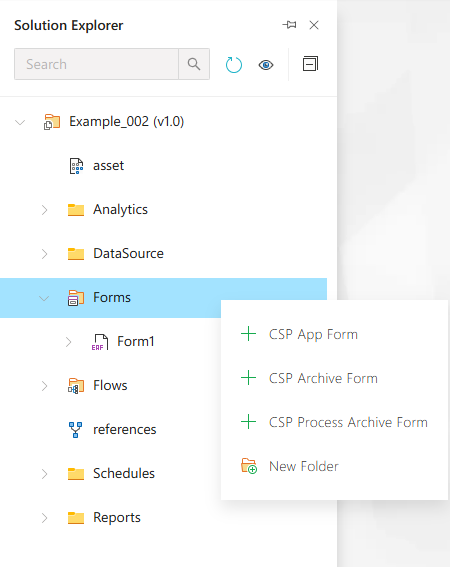
This folder is used to manage and organize all types of forms such as Application Forms, Archive Forms, and Process Archive Forms.
Creating a New Application Form
Right-click the Forms folder and choose New Item, then select Application Form.
This form is used to design user-facing application forms that include controls, actions, and behaviors.
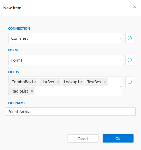
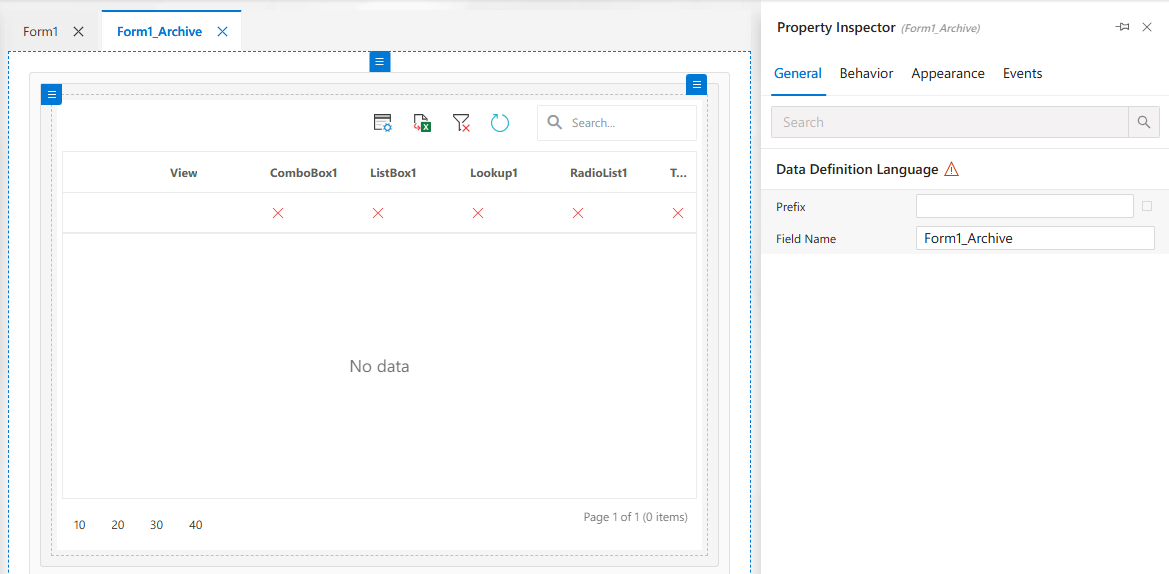
Creating a New Archive Form
Select Archive Form from the New Item list to define forms used for historical data access or storage.
These forms often include view-only components and filters.
Creating a Process Archive Form
Choose Process Archive Form from the same list when creating a form related to archived process data.
These forms connect to archived workflow or process data in Synergy.
Standard Form Controls
Standard form controls include common UI elements like textboxes, checkboxes, dropdowns, buttons, etc.
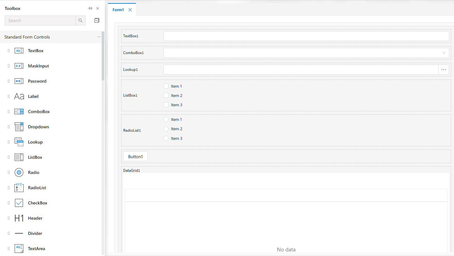
These are essential for basic form input and interaction design.
Advanced Form Controls
Advanced controls offer higher-level features like combo boxes, lookups, and multi-selects.
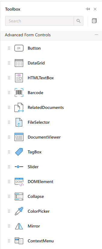
Use these to handle complex user interactions or data-bound inputs.
User, Document, Data & Appearance Controls
Includes controls such as user pickers, document links, date pickers, and appearance modifiers.
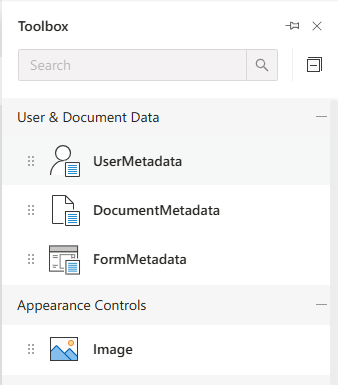
These controls allow integration with documents, users, and time-based inputs.
Container Controls
Use container controls like panels and tabs to structure your form layout effectively.
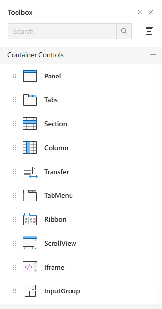
Containers group related controls visually and functionally.
Chart Controls
Add charts for visualizing data directly within the form interface.
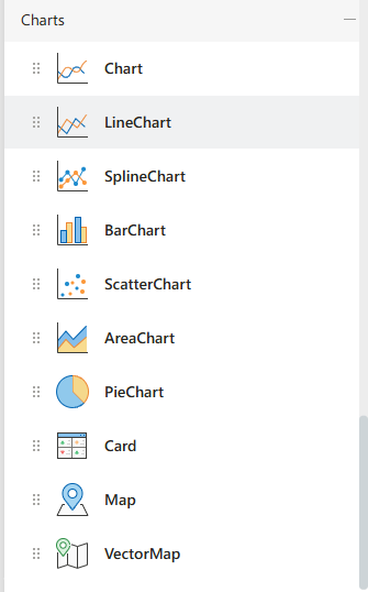
Supports different types of charts like pie, bar, and line charts.
Property Inspector
Allows configuration of the selected control’s properties such as ID, label, binding, and layout options.
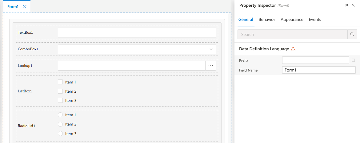
Every control selected from the designer is editable here.
Appearance Settings
Configure how controls and forms look including color, font, size, and alignment.
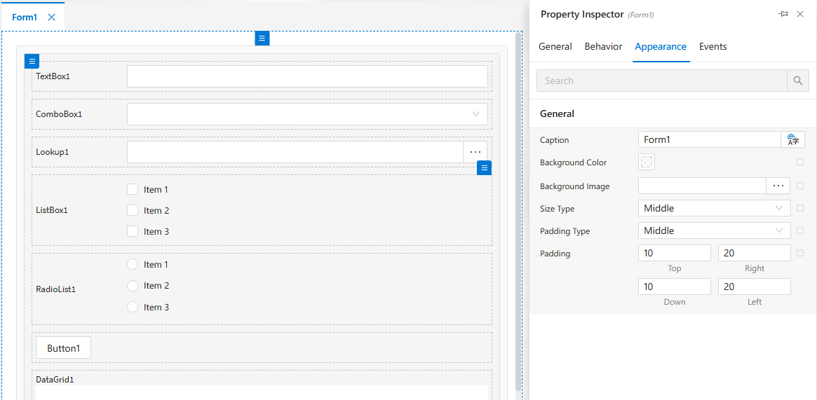
Provides UI consistency and branding customization.
Behavior Settings
Set form or control behavior such as visibility, enable/disable status, and data rules.
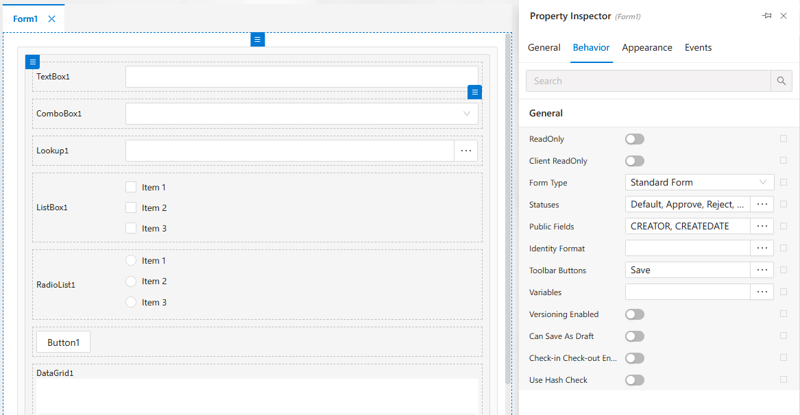
Useful for conditional UI behavior based on user actions.
Client-side Events
Add client-side JavaScript logic for form controls to enhance interactivity.
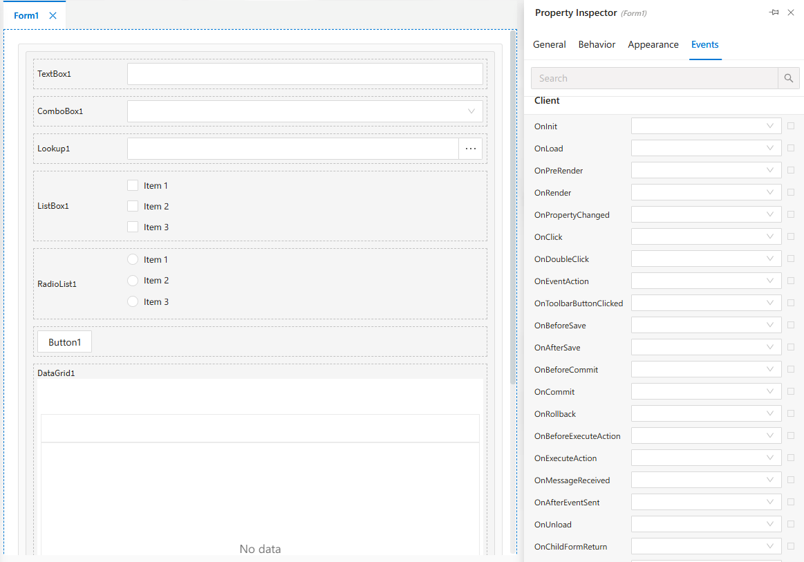
These are executed on the user’s browser at runtime.
Server-side Events
Configure logic that runs on the server when form events are triggered.
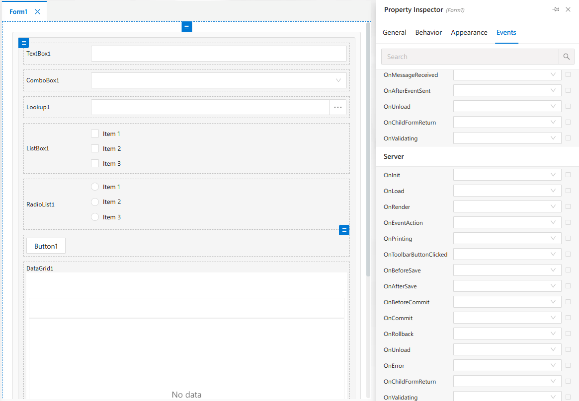
Ideal for validation, data manipulation, and backend operations.
CSP Archive Form – Create View
This is how the Archive Form looks during design.
Fields, layout and filters are placed here.
CSP Archive Form – View Mode
Example of how the form is rendered in runtime.
Provides a read-only view of archived data.
CSP Process Archive Form – Create
This view is used when designing a Process Archive Form.
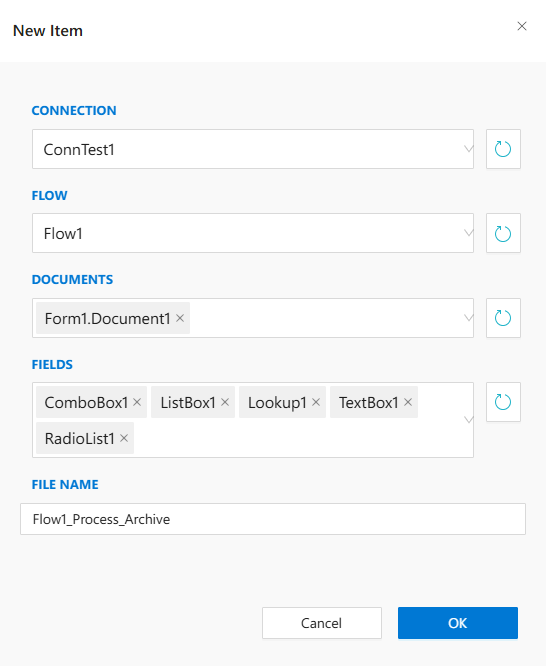
Useful for showing process-related historical data.
CSP Process Archive Form – View
Shows how the Process Archive Form appears to users.
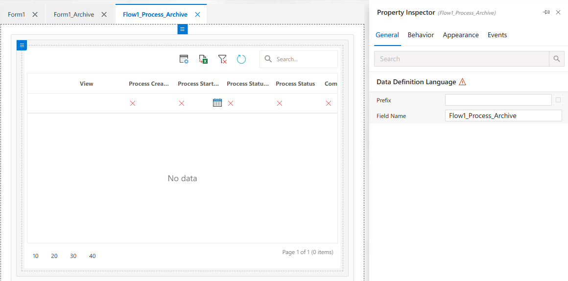
Often read-only and linked to workflow instances.
CSP Process Archive Form – DataSource
Manage data binding of your form from this tab.
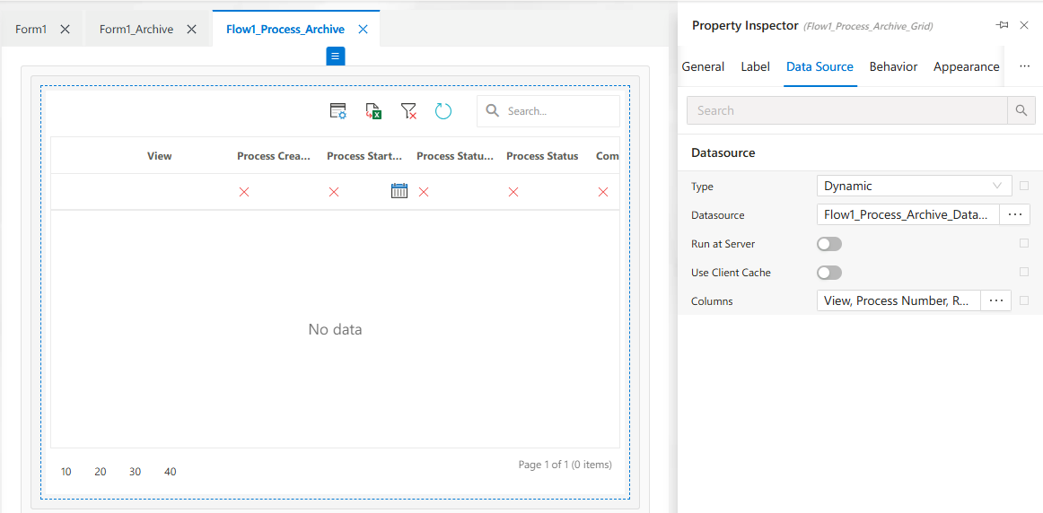
Allows connection to external or internal datasets.
Form Structure View
Shows the structure tree of the form’s controls and containers.
Essential for managing complex form layouts.
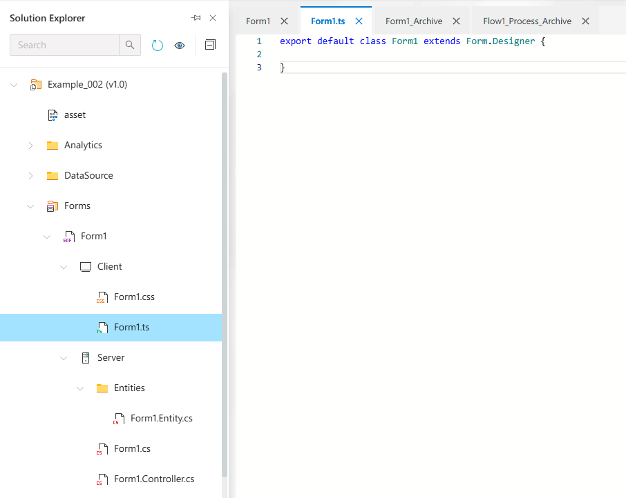
Form1.cs Code File
The backend code (C#) for handling server-side logic of the form.
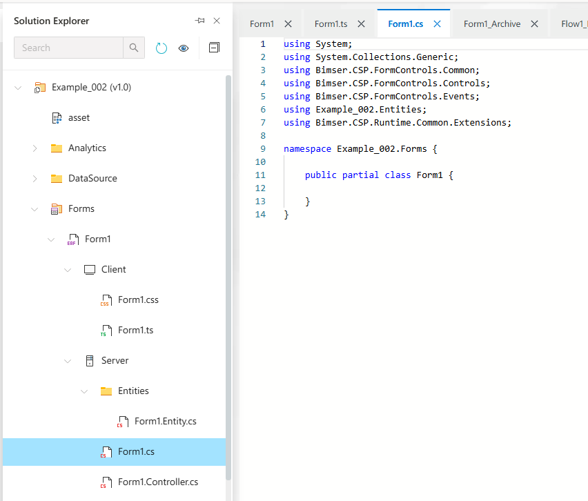
Use this file for business logic, validation, and data operations.